CHOCO.OOTD
BRANDING CONCEPT
Objective :
To design a clean, modern logo that captures the sweet, classic essence of
the brand while staying bold enough to appeal to Gen Z.
Branding Strategy:
Choco.ootd is a teen-focused casualwear brand aiming to become a part of Gen
Z’s everyday fashion and social media presence. The brand emphasizes
timeless chic and demure aesthetics, combining affordability with stylish
cotton and linen clothing.
DATE:
JUN:2024
CLIENT:
CHOCO.OOTD
ROLE:
GRAPHIC & BRANDING STRATEGIST
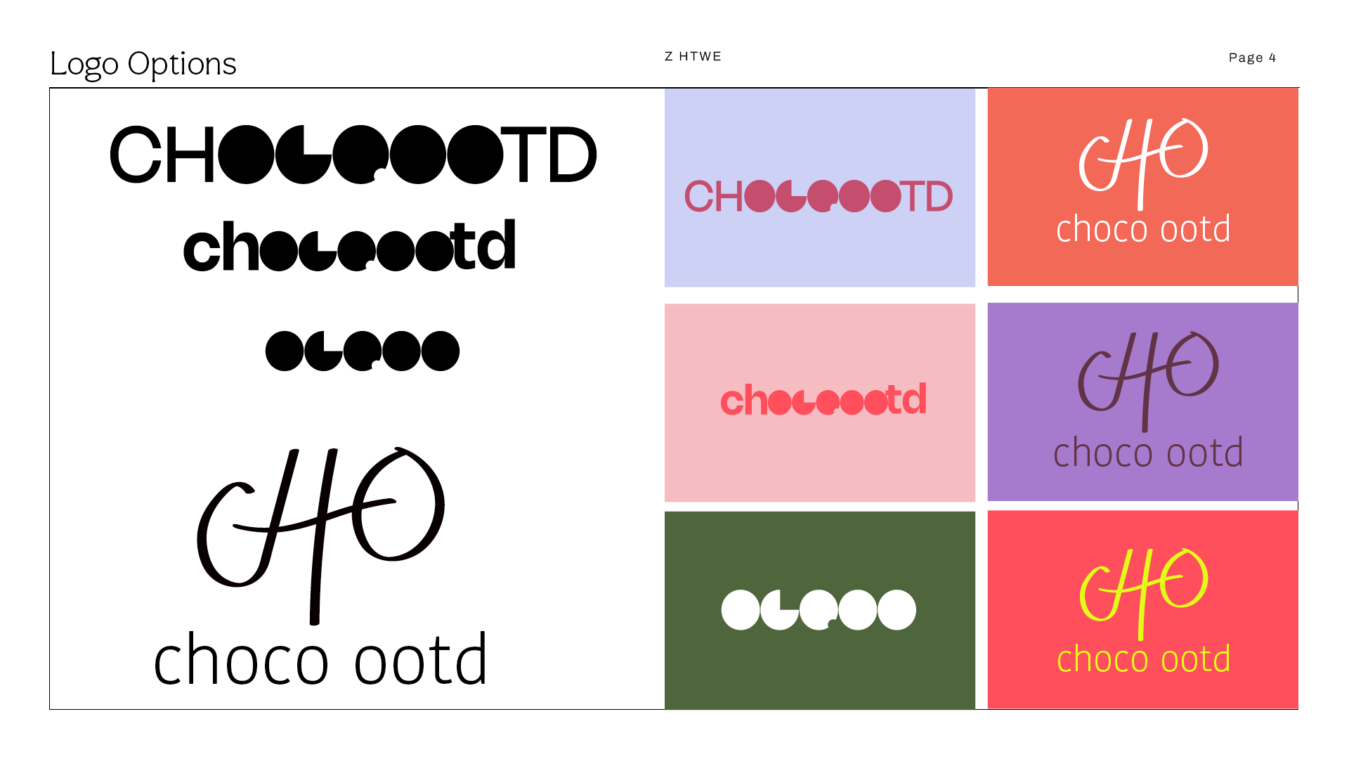
Creative Concept:
I focused on soft yet modern visual elements that could translate well
across clothing tags, packaging, and social platforms. To highlight the
brand’s name:
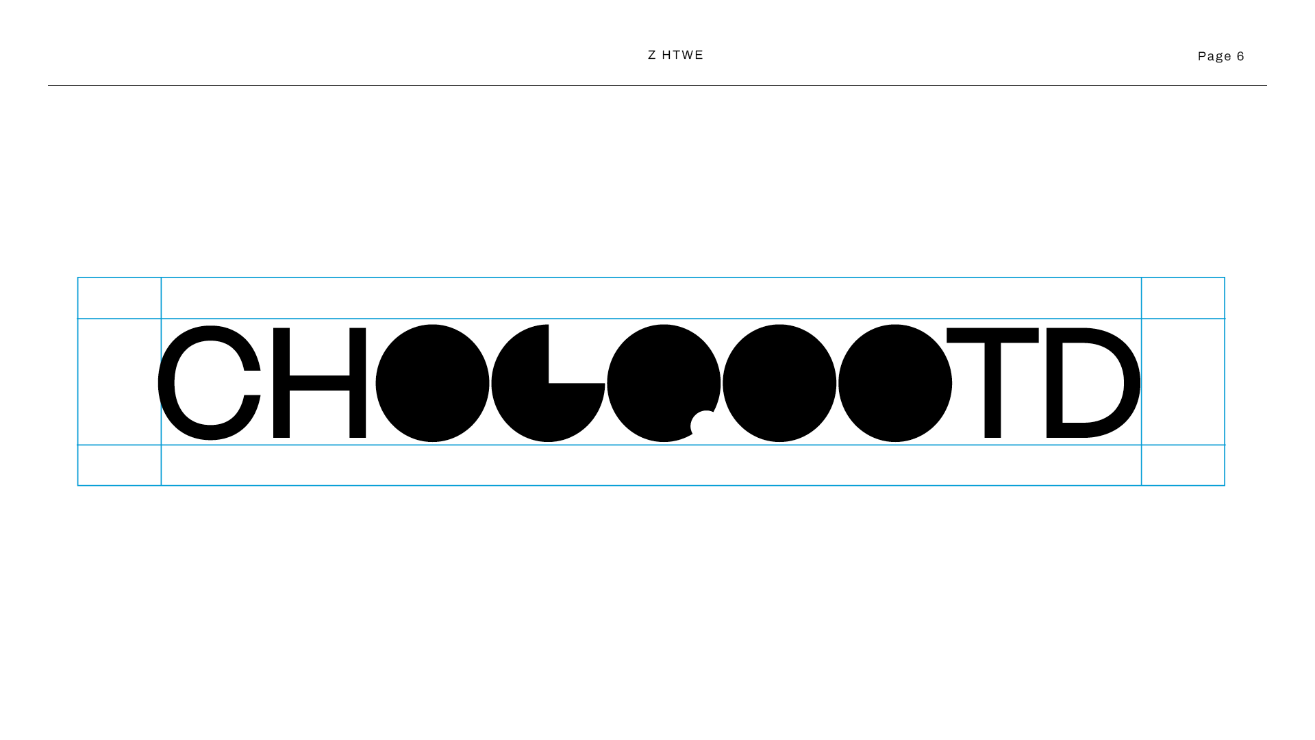
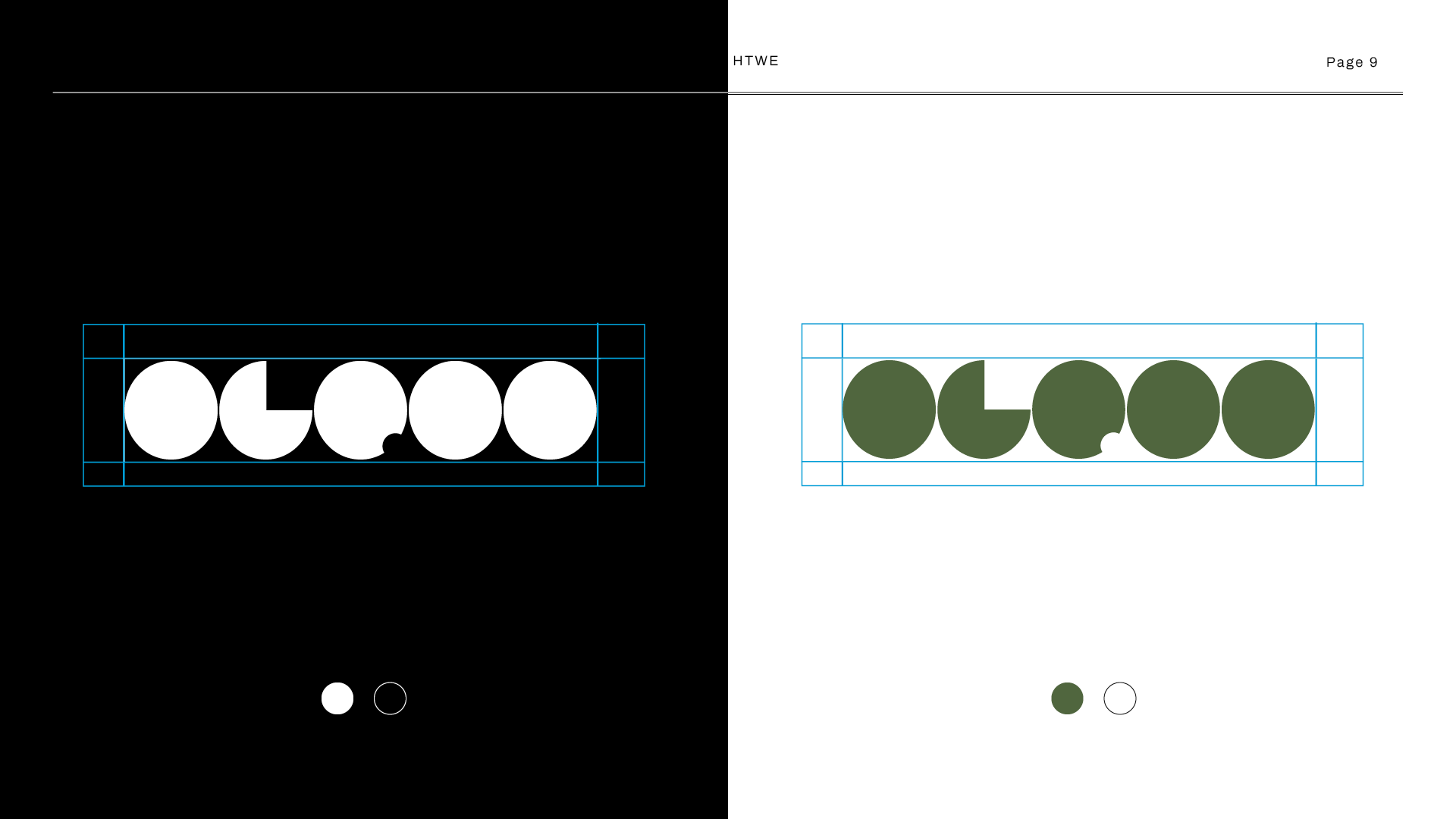
The double “o”s were emphasized with circular forms to symbolize
timelessness and cuteness.
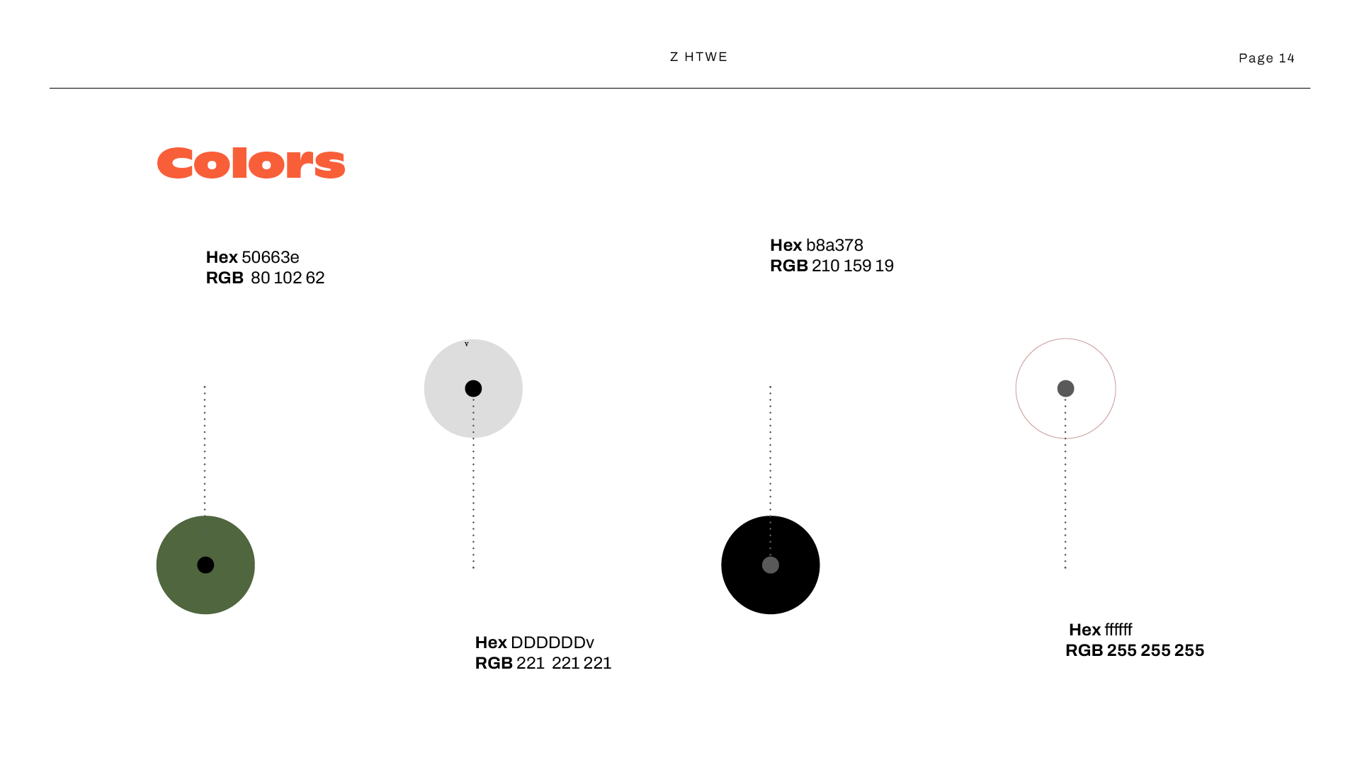
The color palette was inspired by earthy textures, representing warmth,
softness, and casual elegance.
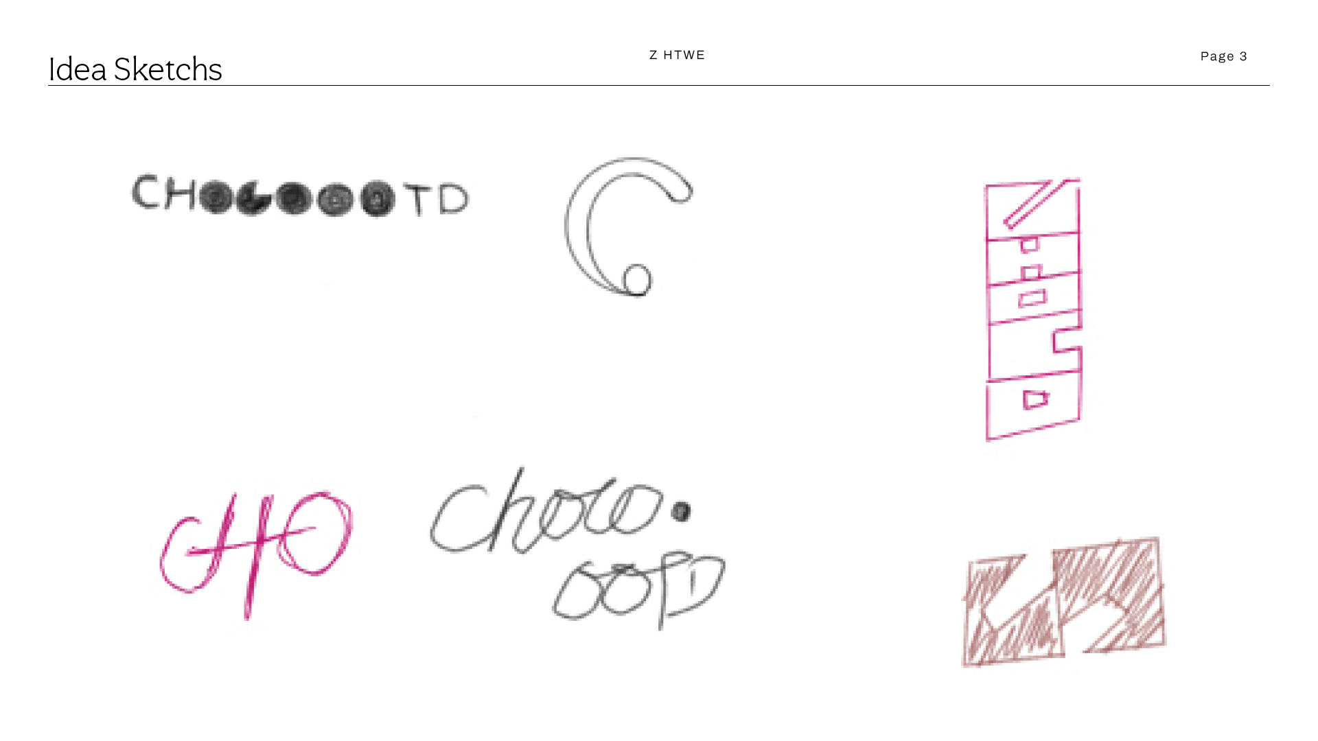
Design Process:
Initial sketch explorations with playful yet minimal letterforms
Multiple logo options reviewed and refined based on brand tone
Final logo chosen for its balance of modern geometry and friendliness
Brand Elements:
Color Palette: Soft neutrals and muted olive/green for a grounded yet
trendy feel
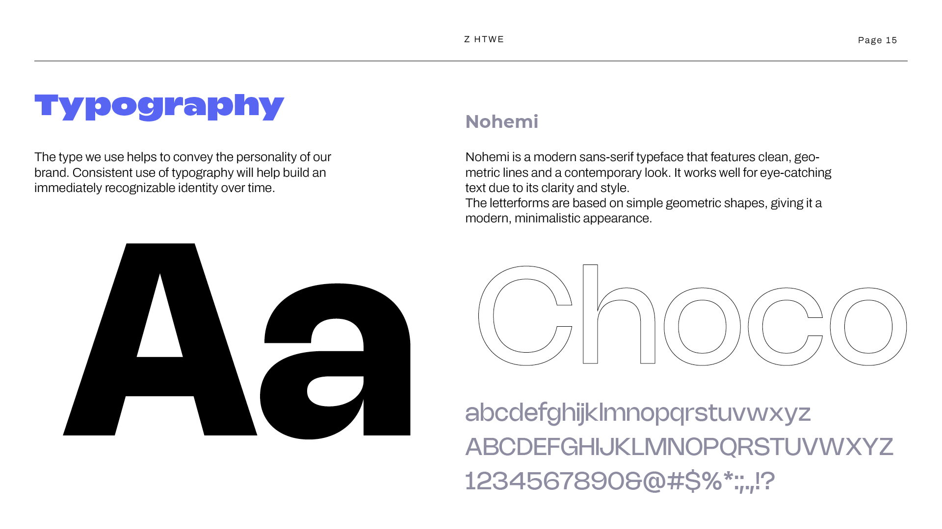
Typography: Nohemi – a modern sans-serif font with clean, geometric
lines to reflect the minimal, stylish spirit of the brand
Outcome:
The final logo reflects Choco.ootd’s identity: simple, chic, and Gen
Z-ready. It stands out in both print and digital formats and provides a
flexible system for future brand assets.


